Some of the most widely used CSS properties are the background-related properties; with which you can define how the background
of various elements is displayed.
With these properties you can set the color or the image displayed as the background.
In addition, you have control over the position, the repetition type (horizontal, vertical, both or neither) of the image.
Furthermore, you can set whether the image should scroll with the contents or should stay in a fixed position during scrolling.
In this article, you can see these functionalities demonstrated in examples among other things.
CSS background properties were introduced to substitude the background related HTML attributes such as:
(
Note: that is the reason all of these attributes are deprecated in the W3C HTML 4.01 specification).
See what you can do with an element's background.
<head>
    <style>
        .redBg {
            background-color:#FF0000;
            /* or background:#FF0000; - shorthand property */
            /* or background-color:red; - predefined color value, not recommended */
            width:200px;
            height:200px;
        }
    </style>
</head>
<body>
    <div class="redBg">An element with red background.</div>
</body>
|
You can specify a background color with the shorthand
background
or with the
background-color property. If you want to specify only a simple color as the background,
the use of the
background-color property is recommended,
because it results in more readable code.
Colors can be specified in CSS in three different ways, by using the RGB method, hexadecimal color values and predefined color names. For further details, please visit the
colors page.
This is the case when you want to use the whole or a part of an image as the background.
Sample image: 
The image can be in GIF, PNG, JPG or BMP format. Recommended are the GIF, JPG or PNG formats depending on the dimensions of the image
(check the size (lower is better) and the quality of the image).
You can specify a background image with the shorthand background
or with the background-image property. In the followings, you can see how.
<head>
    <style>
        .single_image {
            background:transparent url(images/bg_image.jpg) top left no-repeat;
            width:200px;
            height:69px;
        }
    </style>
</head>
<body>
    <div class="single_image">An image as the background.</div>
</body>
|
Note: The image that is used as background cannot be resized from CSS; regardless of the size of the element, the image is shown in its original size.
<head>
    <style>
        .single_image {
            background-image:url(images/bg_image.jpg);
            background-repeat:no-repeat;
            width:200px;
            height:69px;
        }
    </style>
</head>
<body>
    <div class="single_image">An image as the background.</div>
</body>
|
You can create a gradient background with a 1px wide or wider (horizontal gradient) or a 1px tall or taller (vertical gradient) image:
for horizontal gradient:
 for vertical gradient:

With the background-repeat property you have control over how the image is repeated (repeats vertically, horizontally, in both or in neither directions).
a. How to create a horizontal gradient background.
- Create a 1px wide or wider image with your favorite graphics editor program.
- Save it in GIF, PNG, JPG or BMP format. Recommended are the GIF or PNG formats, if you want to make a gradient background.
- Create the code:
Using the background-image,
background-color,
background-repeat properties:
<head>
    <style>
        .hor_gradient {
            background-image:url(images/hor_grad.gif);
            background-color:transparent;
            background-repeat:repeat-y;
            width:100px;
            height:100px;
        }
    </style>
</head>
<body>
    <div class="hor_gradient">Horizontal gradient background.</div>
</body> |
Using the shorthand background property:
<head>
    <style>
        .hor_gradient {
            background:transparent url(images/hor_grad.gif) top left repeat-y;
            width:100px;
            height:100px;
        }
    </style>
</head>
<body>
    <div class="hor_gradient">Horizontal gradient background.</div>
</body>
|
b. How to create a vertical gradient background.
- Create a 1px tall or taller image with your favorite graphics editor program.
- Save it in GIF, PNG, JPG or BMP format. Recommended are the GIF or PNG formats, if you want to make a gradient background.
- Create the code.
Using the background-image,
background-color,
background-repeat properties:
<head>
    <style>
        .ver_gradient {
            background-image:url(images/ver_grad.gif);
            background-color:transparent;
            background-repeat:repeat-x;
            width:100px;
            height:100px;
        }
    </style>
</head>
<body>
    <div class="ver_gradient">Vertical gradient background.</div>
</body>
|
Using the shorthand background property:
<head>
    <style>
        .ver_gradient {
            background:transparent url(images/ver_grad.gif) top left repeat-x;
            width:100px;
            height:100px;
        }
    </style>
</head>
<body>
    <div class="ver_gradient">Vertical gradient background.</div>
</body>
|
Sample images:
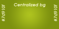
a, A center aligned background image:
Using the background-image,
background-color,
background-repeat,
background-position properties:
<head>
    <style>
        .centralized_img {
            background-image:url(images/centralized_bg.png);
            background-color:#7d910f;
            background-repeat:no-repeat;
            background-position:center center;
            width:100%;
            height:100px;
        }
    </style>
</head>
<body>
    <div class="centralized_img">A center aligned background image.</div>
</body>
|
Using the shorthand background property:
<head>
    <style>
        .centralized_img {
            background:#7d910f url(images/centralized_bg.png) center center no-repeat;
            width:100%;
            height:100px;
        }
    </style>
</head>
<body>
    <div class="centralized_img">A center aligned background image.</div>
</body>
|
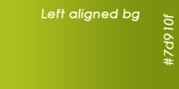
b, A left aligned background image:
Using the background-image,
background-color,
background-repeat,
background-position properties:
<head>
    <style>
        .left_aligned_img {
            background-image:url(images/left_aligned_bg.png);
            background-color:#7d910f;
            background-repeat:no-repeat;
            background-position:left center;
            width:100%;
            height:100px;
        }
    </style>
</head>
<body>
    <div class="left_aligned_img">A left aligned background image.</div>
</body>
|
Using the shorthand background property:
<head>
    <style>
        .left_aligned_img {
            background:#7d910f url(images/left_aligned_bg.png) left center no-repeat;
            width:100%;
            height:100px;
        }
    </style>
</head>
<body>
    <div class="left_aligned_img">A left aligned background image.</div>
</body>
|
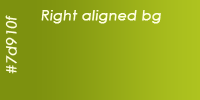
c, A right aligned background image:
Using the background-image,
background-color,
background-repeat,
background-position properties:
<head>
    <style>
        .right_aligned_img {
            background-image:url(images/right_aligned_bg.png);
            background-color:#7d910f;
            background-repeat:no-repeat;
            background-position:right center;
            width:100%;
            height:100px;
        }
    </style>
</head>
<body>
    <div class="right_aligned_img">A right aligned background image.</div>
</body>
|
Using the shorthand background property:
<head>
    <style>
        .right_aligned_img {
            background:#7d910f url(images/right_aligned_bg.png) right center no-repeat;
            width:100%;
            height:100px;
        }
    </style>
</head>
<body>
    <div class="right_aligned_img">A right aligned background image.</div>
</body>
|
Sample image:

You can place the image in a specific position as follows:
Using the background-image,
background-color,
background-repeat,
background-position properties:
<head>
    <style>
        .placed_bg {
            background-image:url(images/image_to_spec_pos.gif);
            background-color:#ff0000;
            background-repeat:no-repeat;
            background-position:20px 50px;
            width:200px;
            height:200px;
            border:1px solid #989898;
        }
    </style>
</head>
<body>
    <div class="placed_bg">Positioned background.</div>
</body>
|
Using the shorthand background property:
<head>
    <style>
        .placed_bg {
            background:transparent url(images/image_to_spec_pos.gif) 20px 50px no-repeat;
            width:200px;
            height:200px;
            border:1px solid #989898;
        }
    </style>
</head>
<body>
    <div class="placed_bg">Positioned background.</div>
</body>
|
The next scriptlet shows how you can manipulate the position of a background image from JavaScript:
<head>
    <style>
        #bg_move_area {
            background:transparent url(images/image_to_spec_pos.gif) 20px 50px no-repeat;
            width:200px;
            height:200px;
            border:1px solid #989898;
        }
    </style>
    <script>
        function MoveBg (event) {
            var x = (event.offsetX)? event.offsetX : event.layerX;
            var y = (event.offsetY)? event.offsetY : event.layerY;
            var bg_move_area = document.getElementById ("bg_move_area");
            if (!event.offsetX) {
                var oParent = bg_move_area;
                var areaX = 0;
                var areaY = 0;
                while (oParent) {
                    areaX += oParent.offsetLeft;
                    areaY += oParent.offsetTop;
                    oParent = oParent.offsetParent;
                }
                x = x - areaX;
                y = y - areaY;
            }
            bg_move_area.style.backgroundPosition = x + "px " + y + "px";
        }
    </script>
</head>
<body>
    <div id="bg_move_area" onmousemove="MoveBg (event);"></div>
</body>
|
You must place the background image at a fixed position:
Using the background-image,
background-color,
background-repeat,
background-position,
background-attachment properties:
<head>
    <style>
        .placed_bg {
            background-image:url(images/fixed_bg.gif);
            background-color:#ffefef;
            background-repeat:no-repeat;
            background-position:180px 60px;
            background-attachment:fixed;
            width:200px;
            height:200px;
            overflow:scroll;
        }
    </style>
</head>
<body>
    <div class="placed_bg">
        text...<br />text...<br />text...<br />text...<br />text...<br />text...<br />text...<br />text...<br />
        Scroll this div!<br />
        text...<br />text...<br />text...<br />text...<br />text...<br />text...<br />text...<br />text...<br />
        text...<br />text...<br />text...<br />text...<br />text...<br />text...<br />text...<br />text...<br />
    </div>
</body>
|
Using the shorthand background property:
<head>
    <style>
        .placed_bg {
            background:#ffefef url(images/fixed_bg.gif) 180px 60px no-repeat fixed;
            width:200px;
            height:200px;
            overflow:scroll;
        }
    </style>
</head>
<body>
    <div class="placed_bg">
        text...<br />text...<br />text...<br />text...<br />text...<br />text...<br />text...<br />text...<br />
        Scroll this div!<br />
        text...<br />text...<br />text...<br />text...<br />text...<br />text...<br />text...<br />text...<br />
        text...<br />text...<br />text...<br />text...<br />text...<br />text...<br />text...<br />text...<br />
    </div>
</body>
|
a, How to create an element with a transparent background:
Most HTML elements' background is transparent by default, but you can set it directly with the
background-color property:
<head>
    <style>
        body {
            background-color:#72b429;
        }

        .trans_elem {
            background-color:transparent;
            border:1px solid #787878;
        }

        .non_trans_elem {
            background-color:#ffffff;
            border:1px solid #787878;
        }
    </style>
</head>
<body>
    <div class="trans_elem">Some content within a transparent element</div>
    <div class="non_trans_elem">Some content within a non-transparent element</div>
</body>
|
b, How to use a transparent image as the background:
Image types that can be used:
-
GIF (Graphics Interchange Format)
The GIF format allows only one of the colors in the palette to be fully transparent.
-
PNG (Portable Network Graphics)
The PNG image format supports alpha channel values for any palette entry. What does that mean?
It means that all colors can be transparent with different opacity.
1, One-color transparency (e.g. sharp edges)
The example GIF (without the checkered background):
Using the background-image,
background-color,
background-repeat,
background-position properties:
<head>
    <style>
        body {
            background:url(images/bg.gif) repeat;
        }
        .trans_bg_img {
            background-image:url(images/rounded.gif);
            background-color:transparent;
            background-repeat:no-repeat;
            background-position:top left;
            width:80px;
            height:23px;
            color:#f6f6f6;
        }
    </style>
</head>
<body style="background:url (images/bg.gif) repeat;">
    <div class="trans_bg_img">rounded</div>
</body>
|
Using the shorthand background property:
<head>
    <style>
        body {
            background:url(images/bg.gif) repeat;
        }
        .trans_bg_img {
            background:transparent url(images/rounded.gif) top left no-repeat;
            width:80px;
            height:23px;
            color:#f6f6f6;
        }
    </style>
</head>
<body>
    <div class="trans_bg_img">rounded</div>
</body>
|
2, Alpha chanel
The example PNG (without the checkered background):
In the following examples, some workaround is ncessary to display a transparent image correctly in older Internet Explorer versions (versions before 7).
We use a conditional comment for version detection in Internet Explorer.
Note: The element must have a layout (hasLayout) if you are going to use the AlphaImageLoader Filter.
<head>
    <style>
        body {
            background:url(images/bg.gif) repeat;
        }
        .trans_bg_img {
            background:transparent url(images/rounded.png) top left no-repeat;
            width:80px;
            height:23px;
        }
    </style>
    <!--[if lt IE 7]
        <style>
            .trans_bg_img {
                background-image:none;
                filter:AlphaImageLoader (src='images/rounded.png', sizingMethod='scale');
            }
        </style>
    <![endif]-->
</head>
<body>
    <div class="trans_bg_img">rounded</div>
</body>
|
8. What you can't do (at this time) with CSS background
-
An element with multiple backgrounds. (Only workaround possible with positioned elements. Elements must be placed above the others.)
-
You can't change the dimensions of the original image used as background. Its horizontal and vertical size is independent
of the dimensions of the element for which it is used as background.
-
You cannot specify the horizontal or vertical starting position of the repetition of an image if the image is repeated; the
background-position is automatically set to left top.
Further reading
Thanks for reading!
Any suggestion is highly appreciated.


No Comments